Here’s a list of sites with county, state and national data on the pandemic
Many websites offer county-level data about the novel coronavirus and covid-19 that is updated daily; other sites largely focus on state and global data.
Websites that offer county-level data:
- KYcovid19.ky.gov: The official covid-19 website for Kentucky includes a Covid-19 Dashboard with county-level data on cases and rates per 100,000 people.
- WFPL offers a tracker with county-level data, including information on vulnerable populations in each county.
- The Lexington Herald-Leader regularly updates seven charts tracking Kentucky’s cases and testing, including a map with cases by county.
- The Louisville Courier Journal also offers daily covid-19 tracking, including case and death numbers by county.
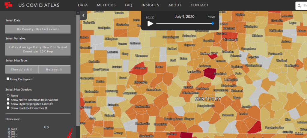
- UScovidatlas.org: A county-level covid-19 surveillance tool by the University of Chicago‘s Center for Spatial Data Science. In addition to basic visualizations at county and state levels, it notes statistical hotspots and has a tool that shows changes over time. It also provides information from the County Health Rankings for each county.
- CovidActNow.org: This site provides data and risk levels for states and counties, using several indicators: cases, testing, hospitals and contact tracing. It also provides updated virus-transmission rates.
- The Johns Hopkins Coronavirus Resource Center provides global, U.S. and county level data and is a source for some other sites.
- The Harvard Global Health Institute has a color-coded map that can make it easier to determine the covid-19 risk in your county. The colors also indicate measures like contact tracing, rigorous testing and stay at home orders.
- The New York Times tracker offers global, national, state and county-level data; the newspaper says it is tracking every case in the U.S.
Covid-19 websites that offer data on the state and national levels:
- Covidexitstrategy.org : This site offers detailed information on each state about symptoms and cases, hospitals and testing. On July 9, the website said that because most states are “trending poorly,” indicated by red on their map, it will soon make updates on how each state is graded to make the map more useful, with a new emphasis on new cases per million, the rate of tests that are positive for the virus; and a de-emphasis on case growth.
- The Covid Tracking Project : This site from The Atlantic offers a weekly update that includes cases, testing, hospitalizations and death data. It just launched the Covid Racial Data Tracker.
- 91-Divoc: With a name that is covid-19 in reverse, this site offers an interactive visualization that allows a user to mouse over any point to explore the data, change the scale to logarithmic (better at showing exponentially increasing data) to linear (better at showing human impact), and change what country is highlighted.
- RT.live : This site offers up-to-date values for Rt, a key measure that shows the average number of people who become infected by an infectious person.
- The Kaiser Family Foundation offers state data and policy actions to address the pandemic.