CDC says McCracken Co. has high level of virus transmission; most West Ky. counties, 33 total in state, have medium levels
Centers for Disease Control and Prevention map shows 34 counties with elevated risk of Covid-19.
—–
By Melissa Patrick
Kentucky Health News
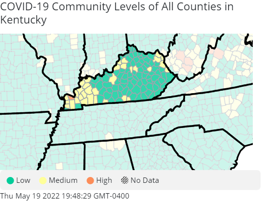
McCracken County and its seat of Paducah are red on the Centers for Disease Control and Prevention‘s latest national Covid-19 risk map, indicating a high level of coronavirus transmission. Thirty-three Kentucky counties, most in the west, are yellow, indicating a medium level of transmission.
Those counties are Hickman, Carlisle, Ballard, Graves, Marshall, Trigg, Lyon, Livingston, Christian, Caldwell, Crittenden, Todd, Muhlenberg, Hopkins, Webster, Union, Henderson, Simpson, Clinton, Cumberland, Hardin, Jefferson, Oldham, Henry, Shelby, Woodford, Fayette, Menifee, Martin, Lawrence, Boyd, Carter, and Greenup.
This is the first time since the April 1 weekly report that Kentucky has had a red county on the map, and the yellow counties more than doubled in this week’s report; last week Kentucky had only 12 yellow counties. West Virginia has a cluster of red counties, including Kanawha County, site of Charleston.
Because of McCracken County’s high level of virus transmission, the CDC recommends that everyone there should wear masks in indoor public spaces. Kentucky’s state guidelines also recommend limiting indoor in-person gatherings, limiting the size of gatherings, and encouraging social distancing.
The CDC says people in yellow counties who are immunocompromised, or at high risk for severe illness from the virus, should talk to a health-care provider about whether they need to wear a mask or take other precautions.
State Public Health Commissioner Steven Stack encouraged Kentuckians to use the CDC risk map to determine the level of Covid-19 precautions that are needed in their community, rather than the state’s daily seven-day infection rate map that is updated on Mondays. The Kycovid.ky.gov site posts the CDC’s color-coded map on Friday mornings, along with community level guidance for each color.
Stack said the CDC map is a better guide to managing risk because the agency’s weekly ratings are based on new virus cases, Covid-19 hospitalizations and the percentage of staffed inpatient beds occupied by Covid-19 patients, instead of just cases per 100,000 people in each county.
“The composite map is the one that really shows you what your risk is, if you’re likely to get exposed,” he said.
The CDC says 9.2% of counties and county equivalents in the U.S. have a high level of Covid-19 transmission, up from 4.25% last week; 15% have a medium level, up from 14% last week; and 76% have a low level of transmission, down from 82% last week.